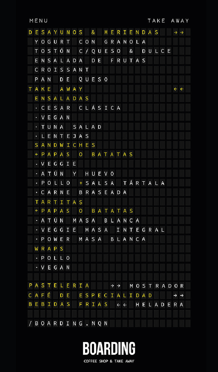
Coffee Shop & Take Away. In order to bring the customer to feel a real travel experience, with appropriations of a typical airport environment, the entire graphic identity takes advantage of prominent objects of our travels, from bags to the passport through the structure linking the platform to the airplane. The brand has been crafted with the intent of looking like an exchange of numbers reminiscent of the departure and arrival airport terminal. Inside the space, a generously sized menu coexists with the same purpose, to give the customer the feeling of being in a platform, which awaits for his flight details when, in fact, the information he’ll find is the menu of the Restaurant and Bar.


